How To Make a Stacked Bar Chart In Google Sheets
Boost your productivity with Sourcetable's AI spreadsheet assistant. Work like a spreadsheet power user and answer all your questions in seconds.

Introduction
Creating a stacked bar chart in Google Sheets is a straightforward process that helps in visualizing data comparisons across categories. This guide will walk you through the essential steps to achieve this.
We will cover data preparation, chart creation, and customization options to enhance readability. By the end, you will efficiently generate informative stacked bar charts.
However, Sourcetable offers a more intuitive alternative through its AI-powered chatbot interface. Instead of manually working with Google Sheets functions, Sourcetable lets you create spreadsheets, generate data, and create stunning visualizations simply by describing what you want. Whether you're analyzing CSV files or XLSX documents of any size, you can sign up for Sourcetable to instantly answer any spreadsheet question through natural conversation.
How to Make a Stacked Bar Chart in Google Sheets
Step 1: Enter Your Data
Begin by entering your data in a survey results format in Google Sheets. Arrange your data in a table format to prepare it for visualization.
Step 2: Highlight the Data Range
Highlight the cells in the range A1:C5. This ensures the correct data is selected for the chart.
Step 3: Insert a Chart
Click the Insert tab and then click Chart. The chart that appears by default will be a clustered bar chart.
Step 4: Convert to Stacked Bar Chart
Click on the chart to select it. Then, click on the three vertical dots in the top right corner of the chart and choose Edit.
In the Chart editor panel, find the Stacking dropdown menu and select Standard. This will convert the chart into a stacked bar chart.
Step 5: Customize Your Chart
Open the Chart Editor by clicking on the three dots in the top right corner and selecting Edit Chart. Use the Chart Style section to modify the font style, border color, and background color.
Edit the chart title, vertical axis title, and horizontal axis title in the Chart and Axis Titles section. Adjust the series color in the Series section.
Customize the font type, size, and format for the horizontal and vertical axes in the Horizontal Axis and Vertical Axis sections, respectively.
In the Legend section, modify the font, position, and format of the legend. Lastly, change the color of gridlines or turn them off in the Gridlines section.
Step 6: Add Data Labels
To add data labels, double-click the chart to open the Chart Editor. Click on Customize and then Series. Check the box next to Total data labels to display the sum of the stacked data on your chart.
Why Learn How to Make a Stacked Bar Chart in Google Sheets
Stacked bar charts in Google Sheets are essential for data visualization and business analytics. These charts allow you to compare total values while showing the composition of each bar segment.
Business Benefits
Understanding stacked bar charts enables better data-driven decision making. These charts effectively display changes in data categories over time or across different groups, making them valuable for financial analysis and performance tracking.
Professional Applications
Mastering stacked bar charts in Google Sheets is valuable for data analysts, marketers, and business managers. The skill helps create compelling presentations, reports, and dashboards that communicate complex data relationships clearly.
Accessibility and Cost-Effectiveness
Google Sheets is a free, cloud-based solution for creating professional data visualizations. Learning to create stacked bar charts in this platform provides a cost-effective alternative to expensive data visualization software.
Try Sourcetable For Free
Spreadsheet AI that helps you answer questions, create visualizations and reports, make formulas, and more.
Learn More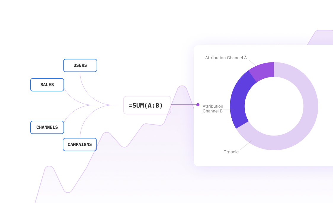
Use Cases for Knowing How to Make a Stacked Bar Chart in Google Sheets
Visualizing Survey Results |
Using a stacked bar chart in Google Sheets allows you to effectively visualize survey results. For instance, you can display the number of males and females who chose different sports as their favorites. This makes it easier to compare preferences across multiple demographics within a single visual representation. |
Comparing Sales Performance |
Stacked bar charts are ideal for comparing sales performance across different products over multiple periods. By converting your clustered bar chart to a stacked bar chart, you can see the cumulative sales figures and analyze contributions from each product category within a specific timeframe. |
Tracking Project Progress |
Project managers can use stacked bar charts in Google Sheets to track the progress of multiple tasks within a project. Highlighting the range of data, and converting it to a stacked bar chart, enables you to see completed, in-progress, and pending tasks, thus giving a comprehensive view of the project's status. |
Analyzing Financial Data |
Financial analysts can leverage stacked bar charts to break down revenue and expenses across different departments. By customizing the chart with relevant titles, font styles, and colors, you can present a clear overview of financial data, aiding in better decision-making. |
Understanding Market Share |
Businesses can use stacked bar charts to understand market share distribution among competitors. By setting up your dataset and converting it to a stacked bar chart, you can clearly see how each competitor contributes to the overall market, facilitating strategic planning and competitive analysis. |
Evaluating Customer Preferences |
Marketing teams can visualize customer preferences for various product features using stacked bar charts. Highlighting and converting your survey data into a stacked bar chart helps in quickly identifying which features are most valued by different customer segments. |
Examining Resource Allocation |
Human resource managers can utilize stacked bar charts to examine how resources are allocated across different teams or projects. By customizing the chart elements and titles, you can easily visualize and communicate resource distribution, enabling better planning and adjustments. |
Monitoring Academic Performance |
Educational institutions can use stacked bar charts to monitor academic performance across different subjects and demographics. By setting up your student performance data and using the Chart editor to customize it, teachers and administrators can gain valuable insights into student achievements and areas needing improvement. |
Sourcetable vs. Google Sheets: A Detailed Comparison
When comparing Sourcetable with Google Sheets, one standout feature of Sourcetable is its AI-first approach. This innovative method offers an AI assistant that simplifies complex spreadsheet formulas and SQL queries, making advanced tasks accessible to all users.
In Google Sheets, creating a stacked bar chart can be a daunting process, particularly for those who are not familiar with data visualization techniques. Users often find themselves searching for detailed guides on how to make a stacked bar chart in Google Sheets. This can lead to wasted time and potential frustration.
Conversely, Sourcetable's AI assistant can automatically generate the necessary formulas and guide users step-by-step to create effective visualizations effortlessly. With its integration of over five hundred data sources, Sourcetable empowers users to search and ask any question about their data without leaving the platform.
Thus, Sourcetable not only saves time but also provides a seamless, user-friendly experience for those needing advanced spreadsheet functions. This makes it the superior choice for answering common questions and performing complex tasks typically associated with Google Sheets.
How to Make a Stacked Bar Chart in Sourcetable
- Creating a stacked bar chart in Sourcetable is simpler than traditional spreadsheet tools. Unlike Google Sheets, which requires manual configuration, Sourcetable's AI chatbot handles all the complexity. Simply upload your data, tell the AI what visualization you want, and it creates the chart instantly. Try Sourcetable today at <a href='https://app.sourcetable.cloud/signup'>https://app.sourcetable.cloud/signup</a> to transform how you work with spreadsheets.
- Start by uploading your data file (CSV, XLSX, or other formats) to Sourcetable. The AI can handle files of any size and automatically processes your data for analysis.
- Simply tell the AI chatbot you want to create a stacked bar chart. You can specify details about the data you want to visualize, and the AI will understand your requirements and create the chart accordingly.
- The AI instantly generates your stacked bar chart without requiring you to understand complex spreadsheet functions or chart settings. You can easily modify the chart by simply asking the AI to make changes.
- Need to adjust colors, labels, or formatting? Just tell the AI what changes you want. It can modify any aspect of the chart through natural conversation, eliminating the need to navigate complex menus and settings.
Upload Your Data
Ask the AI Assistant
Instant Visualization
Customize Your Chart
Frequently Asked Questions
How do I enter data to create a stacked bar chart in Google Sheets?
Enter your data in a survey results format.
What steps should I follow to insert a chart in Google Sheets?
Highlight the cells in the range A1:C5, then click Insert and select Chart. The chart will automatically appear as a clustered bar chart.
How do I convert a clustered bar chart to a stacked bar chart in Google Sheets?
Click on the chart, then click on the three vertical dots in the top right corner and select Edit. In the Chart editor panel, click the Stacking dropdown menu and choose Standard.
How can I modify my chart in Google Sheets?
You can modify the chart by clicking individual elements. In the Chart editor, you can customize the chart title, series color, font type, size, and format of axis labels.
How does the x-axis and y-axis display data in a stacked bar chart in Google Sheets?
The x-axis displays the sports, while the y-axis shows how many males and females chose each sport as their favorite.
What are some common issues with stacked bar charts?
Stacked bar charts do not work well in all data analytics scenarios. The total height of bars is easy to compare, but understanding trends of subcategories can require more effort.
Conclusion
Creating a stacked bar chart in Google Sheets requires multiple steps and complex functions. Sourcetable offers a simpler solution.
As an AI-powered spreadsheet, Sourcetable lets you create visualizations and analyze data through natural conversation. Simply upload your data and tell the AI chatbot what you want to create.
Sign up for Sourcetable today to transform how you work with spreadsheets: https://app.sourcetable.cloud/signup.
Try Sourcetable For Free
Spreadsheet AI that helps you answer questions, create visualizations and reports, make formulas, and more.
Learn More
Recommended Guides
- How to... Answer any spreadsheet question with AI
- How to... how to make a bar graph in google sheets
- How to... how to make a chart in google sheets
- How to... how to make a double bar graph in google sheets
- How to... how to make an organizational chart in google sheets
- How to... how to create an org chart in google sheets
- How to... how to make a pie chart in google sheets
- How to... how to create a gantt chart in google sheets
Work smarter, not harder
Boost your productivity with Sourcetable's AI spreadsheet assistant. Answer all your questions about spreadsheets in seconds. Try for free to get started.